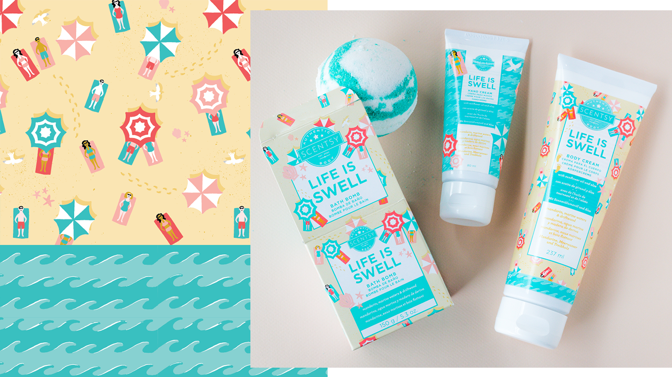
Scentsy Body Packaging
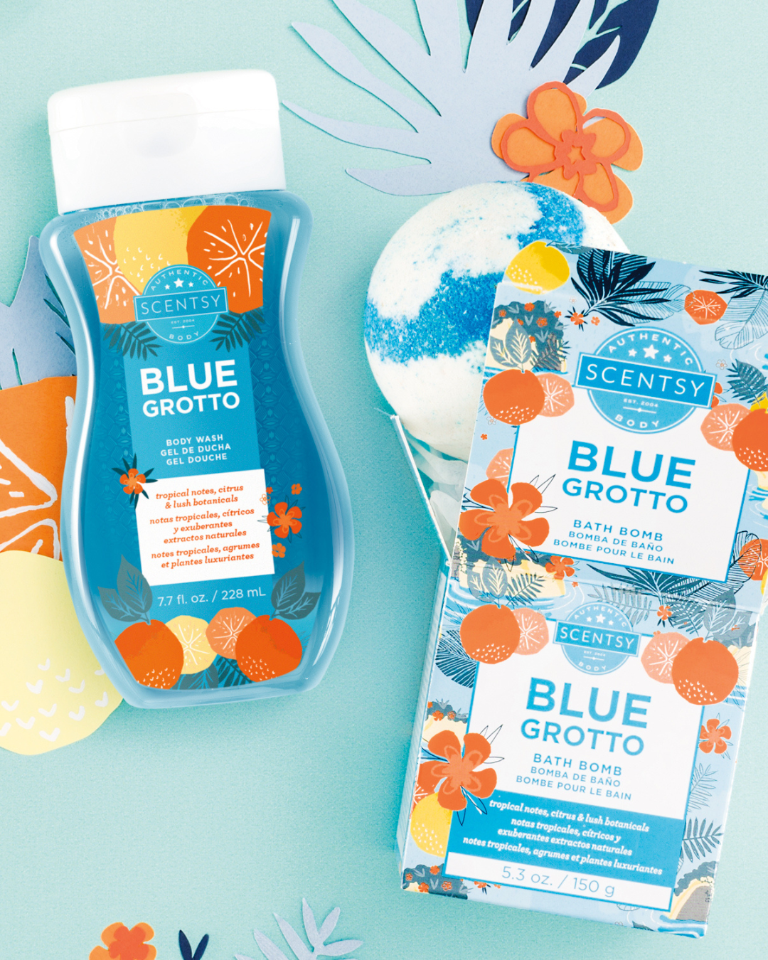
Scentsy customers don’t always have the chance to smell a fragrance before they purchase it, so the packaging design has to convey as much about the fragrance as possible. We strike a balance between literal fragrance elements and the feeling the fragrance brings out in you, by creating a hero pattern and a supporting pattern.
CLIENT | Scentsy
ROLE | Illustration and pattern design for packaging
SCOPE | Ongoing creation of pattern pairs as new fragrances are added to the Scentsy Body lineup

Work within templates that were previously established, but create something that stands on it's own.
I always presented at least two color ways, and the chosen pattern was applied to packaging by the Scentsy production team.
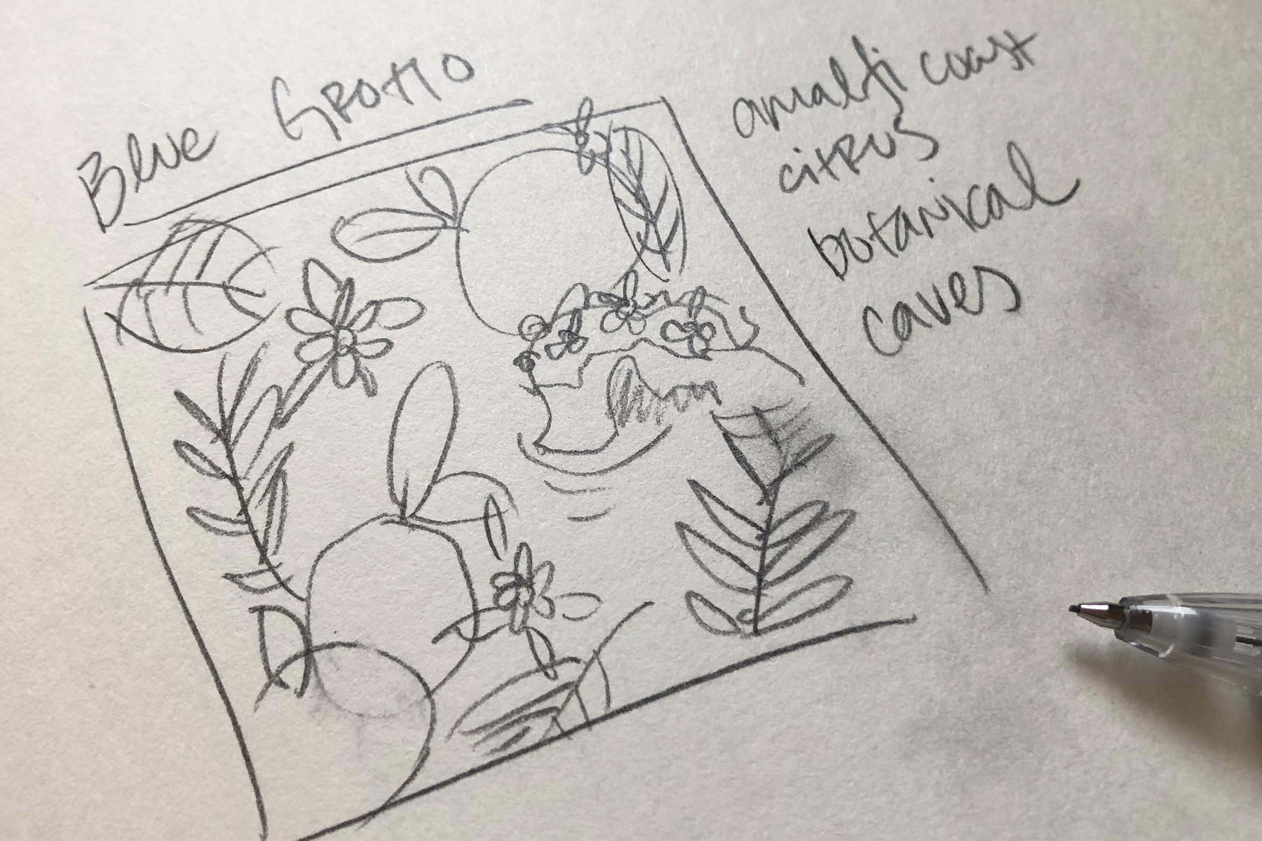
I start with rough sketches and writing down ideas - including phrases I want people to associate with the hero pattern. I pay a lot of attention to the feeling I'm trying to evoke with the artwork.

I draw each element at a super high resolution, then bring it into Illustrator and used the Image Trace function to leave me with vectors that look hand-drawn.
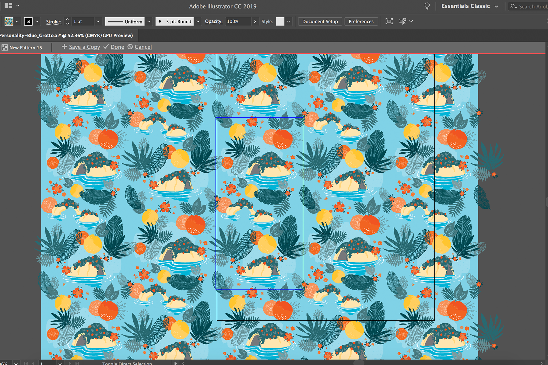
I use the Pattern Tool in Illustrator to color and create each pattern.

The Blue Grotto products are consistent best sellers, and the Life is Swell products did well as a part of the Scentsy Summer Collection.
LESSON LEARNED | Tame the Pattern Tool in Illustrator, and you’ll have a friend for life.