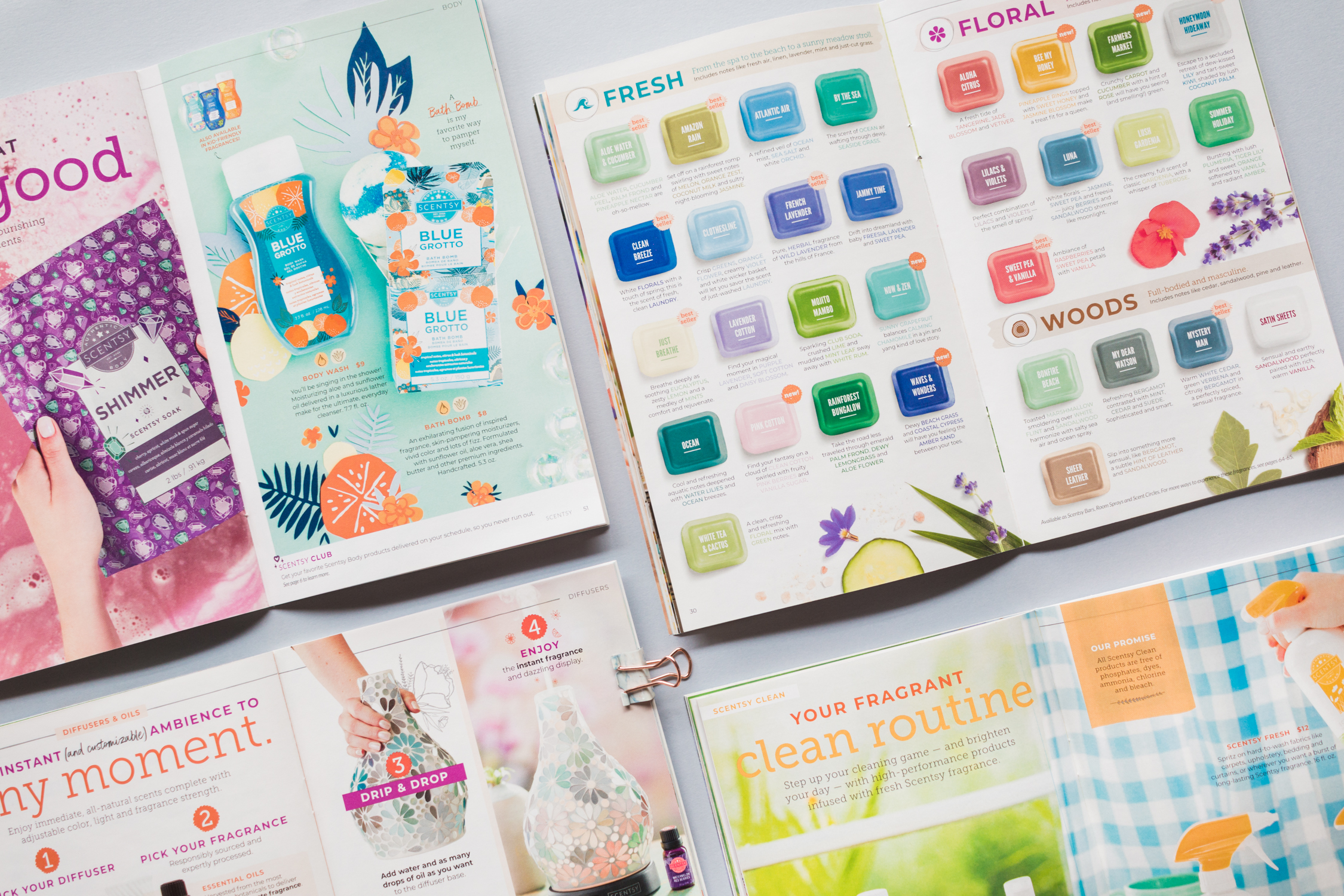
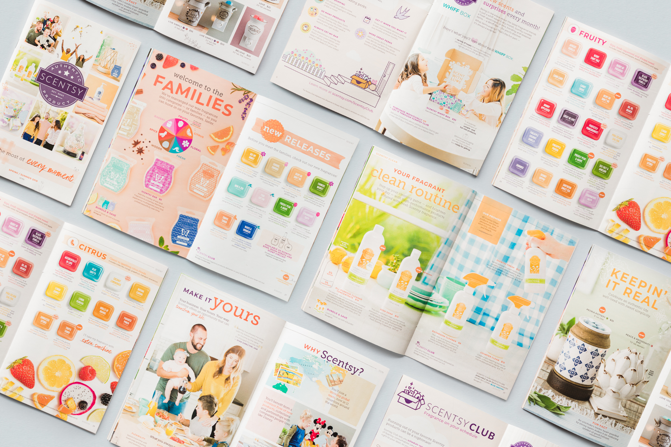
Scentsy Catalog

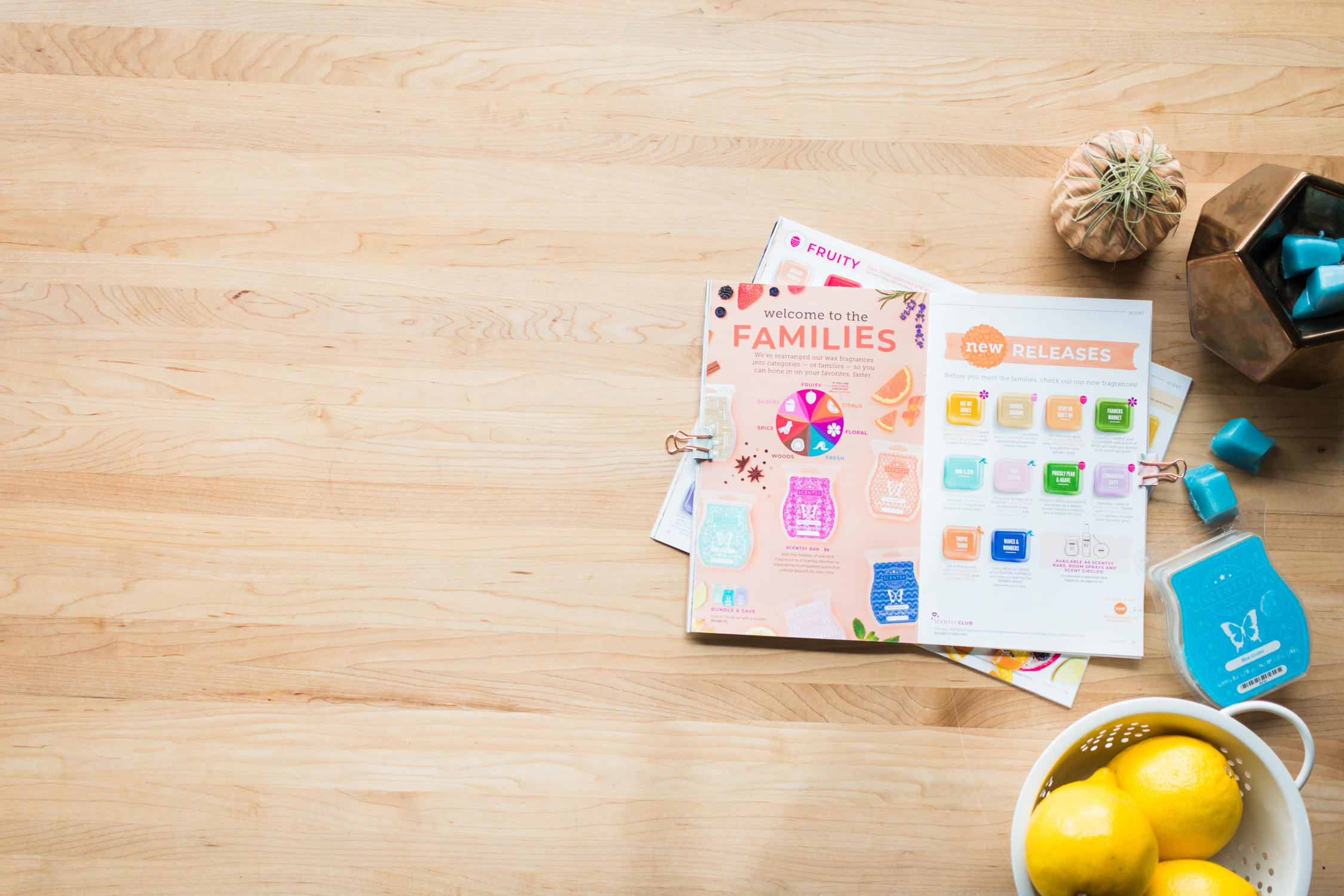
For several seasons, the Scentsy catalog had been designed to feel more like a magazine. It looked great, but it wasn’t the most effective sales tool.
My goal was to keep the catalog beautiful, but make it more functional for customers and sellers.
CLIENT | Scentsy
ROLE | Art direction for photography and design; illustration
SCOPE | 64 pages, 3 million copies, 11 versions in 4 languages
We had less than 6 weeks to come up with concepts, shoot, design, and send this off to the printer.
I was responsible for photo art direction, design, and working with the Scentsy production team to make sure all versions (four languages in eleven countries) were correct.
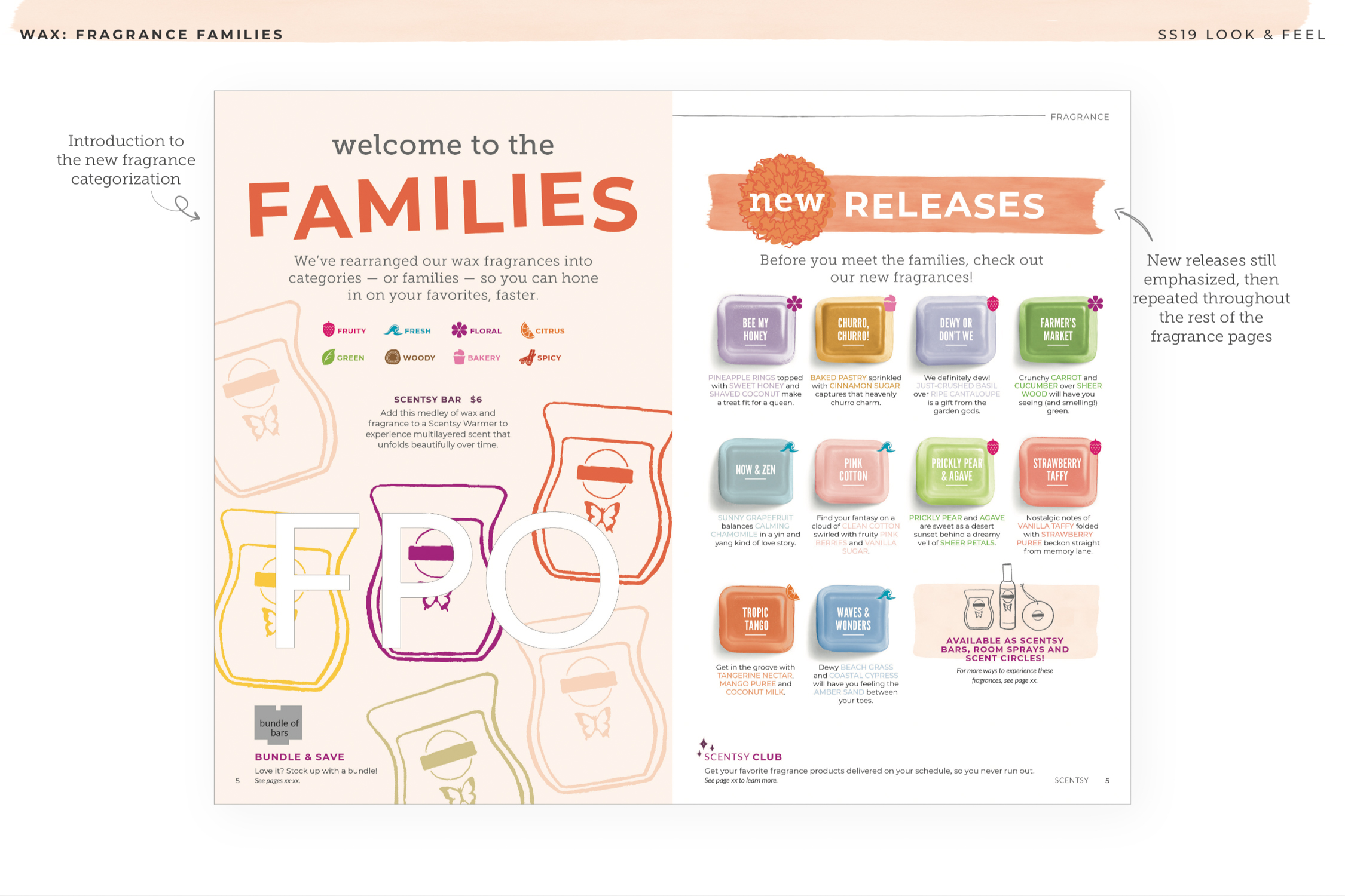
We used flat plans and rough layouts to make sure everyone understood where each product would go and how it would be shown. These documents laid a solid foundation of design thinking to build on.

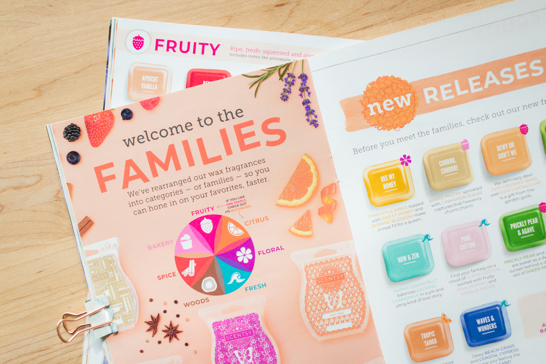
Scentsy products aren’t just seen, they are smelled and experienced. And because we are living in 2018 and not 3018, we can’t build those exact fragrances into a printed catalog - so we try to show fragrance ingredients throughout.
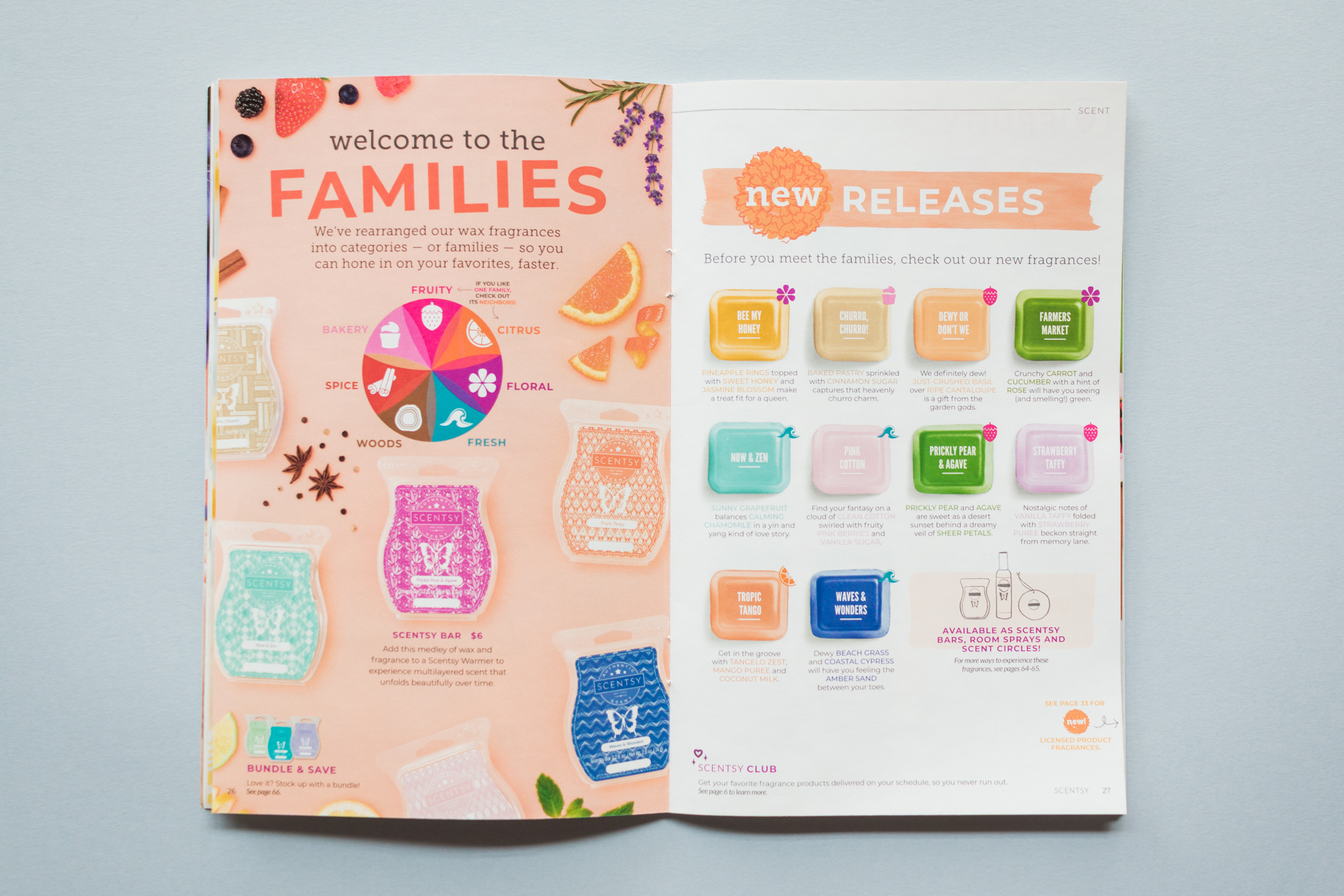
My philosophy on layout design: make each layout feel like more than the sum of its parts. Typography, color choices, and illustration play a huge role in solidifying the right vibe.
A 20% increase from the prior year's sales, and heaps of positive feedback from the Scentsy community! I also helped to cut production costs dramatically by finding more efficient ways to work without reducing quality — like building sets in-studio rather than going on-location.
LESSON LEARNED | User experience principles aren’t just for the digital world! By using page templates, we made the catalog shopping experience easier for the Scentsy community but kept the fun vibe.